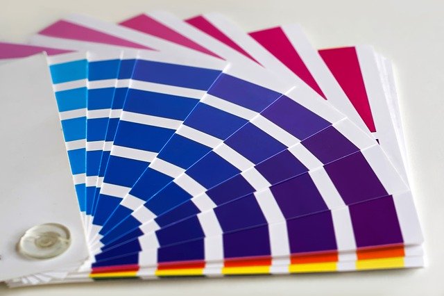
 Have you ever considered the effect colours can have on your mind? Was this a consideration when your company chose its latest branding? In the marketing world there have been many studies into the psychology of colour and how it can help evoke different emotions towards a brand, and even down to the colour of a button on a website driving more sales or enquiries simply because it triggers the brain into thinking “go”.
When you create your next exhibition stand, what would you like your customers to feel? You’d obviously like them to see you, so it’s tempting to choose a cool bright white or a flash of bright orange particularly if that matches your logo, but is this going to encourage customers into taking the right actions with your stand?
If you are a retailer, it’s likely that your products themselves have had a lot of care and thought put into their design. The colours, the style of the packaging right down to the thickness of the cardboard box they arrive in, how they should be displayed. Your stand will need to incorporate colours that compliment the products but also continue the feel of the brand. A great example of this is a stand we recently worked on for a company who had created an “Escape to the Chateau” brand in collaboration with the popular TV show. The products themselves were a subtle nod to the style of soft furnishings you might find in the chateau. What really set the scene for the customers at the retail exhibition was the stand itself, which was built to be a chateau with grey stone walls and arches within the display space so that customers could feel like they were stepping into the magical experience of living in such a grand building, and feel tempted to buy the products so that they could take this feeling home with them.
Another retailer we worked with used deep blue colours in their furniture display stand. This mimicked the colours that are currently popular in interior design, and also match the style of the furnishings. The dark colours allowed lamps to be switched on and displayed in a more natural environment rather than the strip lighting of the conference hall. The stand felt homely and very relaxing and was certainly a calm place to step into among the bright lights and buzz of the exhibition hall. The result was that customers were tempted to stay longer, were more relaxed and able to explore and think about the products rather than feeling hurried or distracted.
Relaxed is not always the right customer mode though. Other brands might want their customers to feel invigorated, refreshed, excited and powerful. In this scenario, for example for sports and nutrition type brands, green is a very popular colour as it signifies things that are new, natural and fresh.
Children’s brands tend to draw more attention when they are playful and use bright primary colours. The brain loves bright colours and is naturally attracted to them and becomes curious and wants to get involved. This is one of the reasons so many of us are glued to our smartphones. Brands that want to say “come and play” will do well with anything shiny, bright, sparkly and bold!
Our stand designers will be able to help you find colours that will work well with your logo, branding and products yet evoke the first impressions and mood you want to set on your trade stand. When we work with clients, we’re able to send you computer generated mock-ups of our ideas so that you can experiment with something a little different to see how it might look before committing to a build. We’ll help you every step of the way through the stand design, giving you the confidence to be bold with your brand.
© 2026 Sovereign Exhibitions (PS4D Ltd T/A Sovereign Exhibitions & Events) | Credits | HTML Site map